Afinia Dental Case Study
Branding + Print Design + Product Design + Development
- Industry: Healthcare - Client: Afinia Dental - Location: Cincinnati, Ohio - Time frame: 2012-2016 - Services: Web, print, motion, and brand design - Software: Adobe CC, Wordpress, and Code (html, css)
This case study details product design work for Afinia Dental, a spa-like dentist offering full-service care at three comfortable locations in Cincinnati, Ohio. From 2012 to 2016, as Lemmond Design, I managed all digital and print design aspects remotely from South Bend, Indiana, including the main product, afiniadental.com, and their social networks. Here's how I solved the problem. The primary challenges addressed in this project and their business-oriented solutions focused on enhancing accessibility, tracking advertising effectiveness, and refining brand perception. P.s., the truth is that Dr. Andrew was a very good person, but can I just say that it was hilarious to advertise 'Doctor Killgore' as the spa-like dentist who would calm your nerves about dental procedures?

Professional Practice: A high-end, technology-focused dental practice required a complete, long-term (4-year) brand and product design strategy. The challenge was threefold: 1) Redesign the brand to reflect a "spa-like" atmosphere, 2) Build a responsive, CMS-driven website that increased appointment registrations, and 3) Implement a system to track advertising ROI.
Outcome: As the lead designer on all aspects, I engineered a full rebrand, launched a new WordPress site that streamlined patient acquisition, and implemented a data-tracking system that identified and eliminated inefficient marketing spending. This project demonstrates full-stack management, from brand identity and UX/UI to product management and data analysis.

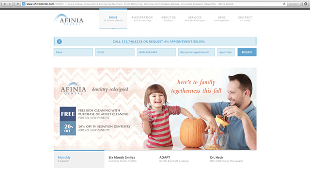
Responsive, CMS-driven Website for Appointment Registration:
The goal was to create a fully responsive, accessible website that prioritized appointment registration. I developed a WordPress site that the client could easily edit, integrating an appointment scheduler directly into their existing scheduling software. This streamlined the patient acquisition process and led to an increase in online appointment bookings and a reduction in administrative scheduling overhead.

Business ROI and Data-Driven Ad Efficacy Tracking:
Afinia Dental needed a method to track the efficacy of its brand across various channels, from print to Google Ads. My solution involved implementing a system of tracking tools, including Google Sheets, unique landing pages, and dedicated phone numbers. This allowed for precise measurement of ROI for each advertising outlet, such as Google Ads, Facebook, and Valpak direct mail. By identifying which campaigns performed best, Afinia Dental could optimize its marketing spend, reallocating resources to more effective channels and ultimately lowering customer acquisition costs. Through this process, we discovered the printed Valpak ads were inefficient. When it comes to marketing, I always tell clients your digital storefront and sign are so much more important than your physical doorfront and sign.

Visual Rebrand Reflecting Tasteful Atmosphere:
The objective was a visual rebrand that conveyed Afinia Dental's spa-like, clean environment and amenities. This wasn't about a drastic overhaul but a subtle refinement that maintained the brand recognition built over five years in Cincinnati. The improved visual identity aimed to enhance brand perception, attract new patients seeking a comfortable dental experience, and reinforce client loyalty, differentiating Afinia Dental in a competitive market. My visual redesign choices were deliberate and aimed at reinforcing Afinia Dental's calming, spa-like identity while retaining established brand equity.

Logo and Color:
I selected a typeface with softer, rounded corners and increased character spacing. This choice aimed to create a more open, inviting, and less clinical feel, aligning with the spa aesthetic. I eliminated the previous green in favor of a much softer blue. Blue often evokes feelings of calm and trust, which are desirable associations for a dental spa. The translucent arches with a soft, upward motion in the logo further reinforced a sense of lightness and comfort.
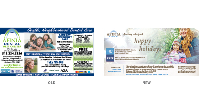
Photography and Texture:
I incorporated custom my own photography and carefully selected stock photos that conveyed the desired serene atmosphere. Additionally, I utilized ample whitespace and incorporated sparkly textures. Whitespace contributes to a clean and uncluttered look, while subtle sparkly textures can add a touch of modern sophistication and luxury.
Click Through Yourself:
I no longer manage the afiniadental.com product, but archival versions of the website can be found in the following excerpts from the Wayback Machine. FYI, many of the pages are buggy now, especially the 2012-based custom CSS I did for the scheduler, but there's enough there with images, type, and color for you to see I have good taste. This is a warning to all you designers: Please triple-backup your work. JIC, you lose multiple hard drives like me and are now humbly dependent on the WayBack Machine.
- https://web.archive.org/web/
20141218233819/http://www.afiniadental.com/ - https://web.archive.org/web/
20150711143139/http://www.afiniadental.com/ - https://web.archive.org/web/
20141218233819/http://www.afiniadental.com/ - https://web.archive.org/web/
20131123021938/http://www.afiniadental.com - https://web.archive.org/web/
20150601235656/http://www.afiniadental.com/june-coupon/ - https://web.archive.org/web/
20141216193931/http://adaptdental.com/