All The Logos
Branding
I love logo design. Here is a collection of my best logo designs from 2007 until now.
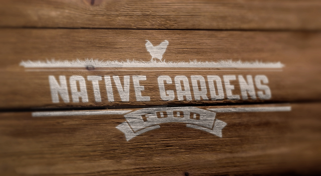
Native Gardens Food
Native Gardens Food is a USDA organic and free-range meat company. To communicate the company's commitment to free-ranged animals, I illustrated a single chicken moving in a large field of grass, undoubtedly eating rocks and bugs like nature intended.
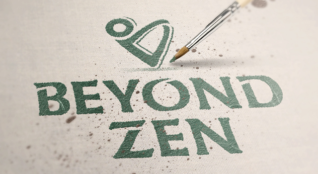
Beyond Zen
After hours of research on the competition, word clouds and sketching I landed on a beautiful brand signature that communicated what Beyond Zen represented. The brandmark is a cute, asexual figure in motion forming the boat position, which is iconic in both yoga and pilates.
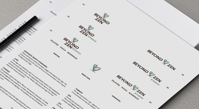
Beyond Zen
Additionally, the brandmark merges the letter B (for Beyond and Bridgette) with a heart to support the loving nature Beyond Zen wanted to create. I crafted the logotype to match the cuts and shapes found in the brandmark. The colors were selected to inspire relaxation and match the studio color scheme.

Valholla Meade
Only royals would drink from the horn in life, but in Valhalla, only slain Viking warriors drink from the horn! Mead is an ancient, honey-based, alcoholic beverage with many historical connections, the most notable being with the Norse (Vikings).

Valholla Meade
A classic wine glass appears by looking in the negative space between the two horns, connecting an ancient drink reserved for the best and its modern equivalent, Valholla Meade. Some might even see the horns as the bow of a longboat quickly approaching!

Afinia Dental
I didn’t want a significant change. It was important to hang onto the brand identity Afinia already had. I was inspired by David Airey’s book, “Logo Design Love,” which influenced me in visual brainstorming. I used the regular typeface and spread out the characters, so there was room.

Afinia Dental
I eliminated the green and used a much softer blue, making the arches translucent with an angelic, upward motion. When we did this rebranding, they were building a third location, a dental spa, so the rebranding coincided with that.

KIS Branded Specialties
KIS Branded Specialties keeps the world of promotional marketing products simple. They research the industry, explore potential products and deliver recommendations.

KIS Branded Specialties
More KIS Branded
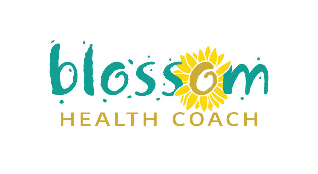
Blossom Health Coach
Blossom supports you in opening up and realizing your beautiful self. Owner Kelly Thompson provides personal coaching to help you reach your health and wellness goals.
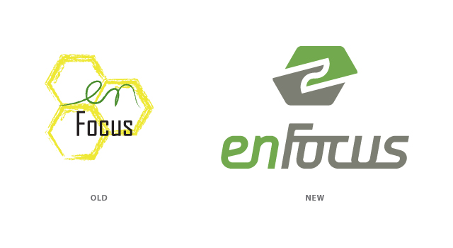
enFocus
What enFocus members saw as cells in their brandmark resembled beehives to the uninitiated. Nobody knew how to read it. There also were significant illegibility problems – thin lines or a yellow that caused the logotype to fade; a rasterized brandmark lacking scalability of a vector brandmark and preventing its use on embroidered shirts or promotional banners. I maintained a hexagon shape, but offset it as two pieces coming together to evoke a handshake and a lowercase e. The new brandmark and logotype demonstrated a left-to-right movement, communicating progress. I chose three warm colors from a more refined Pantone palette: gray (corporate, serious and strong), green (organic growth, an idea, ingenuity) and a golden yellow that carried over from their previous identity.