All the Websites
Product Design + Development + Branding
Here are excerpts from my best product design work!

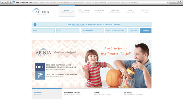
Afinia Dental's website, I made the “Schedule Your Appointment” feature one of the first things you see. I integrated their record-keeping software with links that lead customers to complete registration forms. The rest of the site design used terminology customers would understand.

The A&S Honors website is a fully responsive website that I coded from the group up.

This website is especially unique because I based the menu design off the article by Josh Clark entitled How We Hold Our Gadgets. This research makes a compelling argument to drop the obligatory “hamburger” menu we see everywhere in interactive design for a bottom-anchored menu that is much more ergonomically friendly.

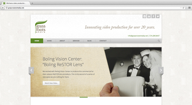
The Grass Roots Media website was dated, not responsive to various devices, cumbersome for staff to edit and for clients to navigate. When my work began, it had been years since the site was updated. I wanted to get their videos in front of the user right away. The homepage teases their most important work in the slider, latest projects, and recent posts.

I rearranged the site design around straightforward words: Work, About, Services, Blog, Contact, People, Testimonies. Any time I sit down with a client, I always make a responsive web design. It’s essential to ensure a website shows up on multiple platforms. I helped them put all their videos on a separate, Vimeo server. That makes their site run a lot more quickly and gives a more careful presentation than YouTube. They also don’t have to pay for a ton of storage with the hosting company.

I always make my web designs editable so clients can make changes. I set up their blog, so anything posted there is automatically posted to Google+, Facebook, Twitter, etc. I put organic textures in the background to support their branding. It gives the website an earthy, tactile nature. You feel like you can touch the background. My relationship with them began at an open house. After designing their site, I was kept on retainer to do web edits, social networking and populate their videos. Out of working together, we developed a referring partnership.

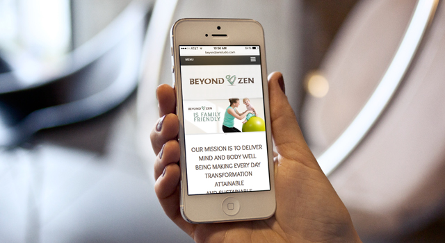
For the website, rather than a textual list of courses, I chose to visually represent each class with a picture so users that were unfamiliar with everything Beyond Zen offers. I also integrated MindBody software so that any changes they made in MindBody would automatically push to their website.

More Beyond Zen...

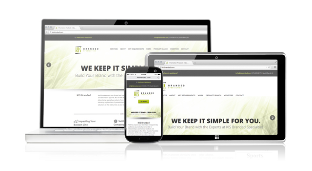
KIS Branded

More KIS Branded...